MAMATH
Portfolio + Blog
I'm an artist in Brisbane and Mamath is my little indie art brand and online presence. :) I love comics and illustration and make merch to pay my bills. I run the annual Comicstreet indie comics market in Brisbane.
Tiny Pantheon: A Rant-rospective

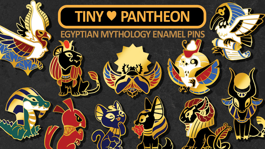
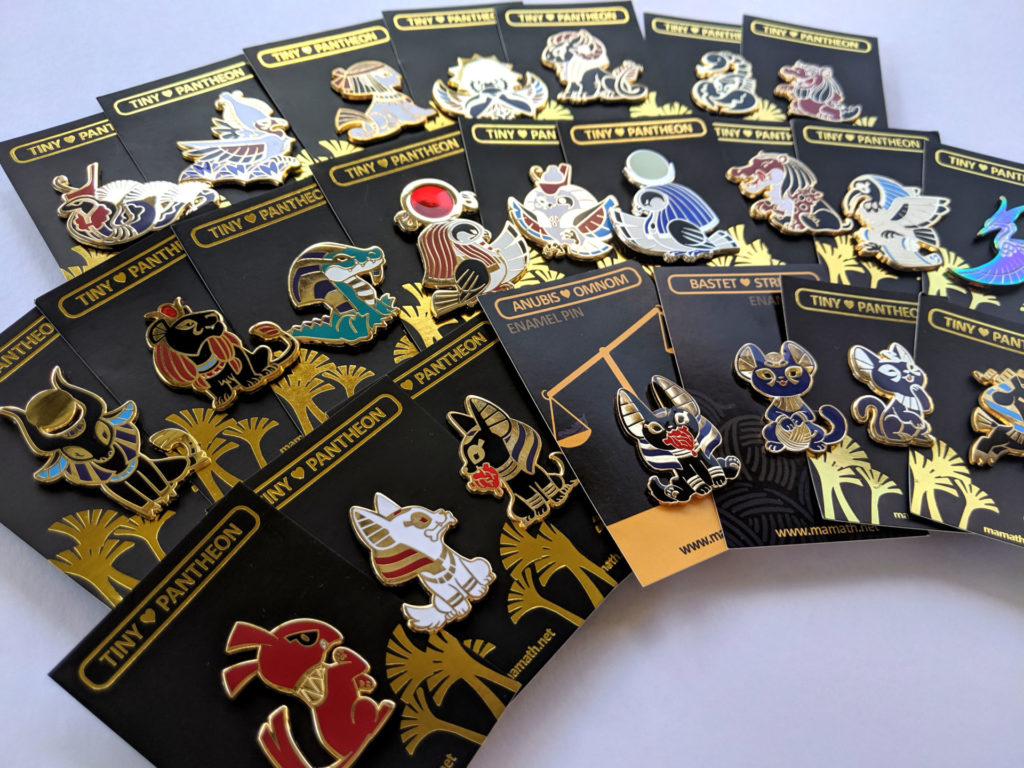
Tiny Pantheon is probably one of the things I am best known for on the internet – at the time it was the highest earning enamel pin campaign on Kickstarter (though it was dethroned the very next month). It wasn’t the first time I’d designed something that went somewhat viral but it was definitely the most publicly visible. Enamel pin collecting is ultimately a bit niche, though, so in the grand scheme of things it’s my weird claim to z-class internet fame!
What is there to say? I actually think Tiny Pantheon’s success has more to do with marketing tactics and timing than it does with design work – though I do think the pins make a nice cohesive set with a lot of general appeal. Some of it came down to luck, too – I had been trying to make enamel pins for years – long before the market got over-saturated – and so I was ready for the wave of interest that has overtaken art circles since.

Still, let’s pretend for a minute that I’m an incredible design genius and the success of the Kickstarter is solely down to how great my pin designs are. I did work pretty hard on them, after all!
Having since seen a lot of other pin designs and pin crowdfunds, I’m of the opinion that where a lot (most?) of less successful designers go wrong is simply dashing out a drawing and turning it into a pin with no further thought. This can work if the artist is already a very strong line artist with a little luck on their side – but more often than not the end result is…a messy drawing poorly converted into unforgiving metal. It’s important with enamel pins to not only have strong purposeful lines but also to keep in mind the limitations of the form and a pin’s ultimate purpose (that is, to be worn or otherwise displayed and probably viewed from a couple feet away).

Tiny Pantheon follows almost all the informal rules of pin design. The high contrast between gold metal and the other colours (mostly black, red and mid to dark blues) not only makes the set cohesive but ensures the designs will read well in any lighting. The limited colours also make for easier enamel filling – less colours means less mistakes to make. Enamel is usually filled by hand with syringes so the more complicated you make the filling process, the harder it is on those factory workers to keep everything straight! I tried to keep my fill spaces above 1mm to cut down on fill errors. I made sure the silhouettes were relatively simple too, as that makes it easier for factory workers to remove metal flash and means the finished product is less prone to catching on things when worn.

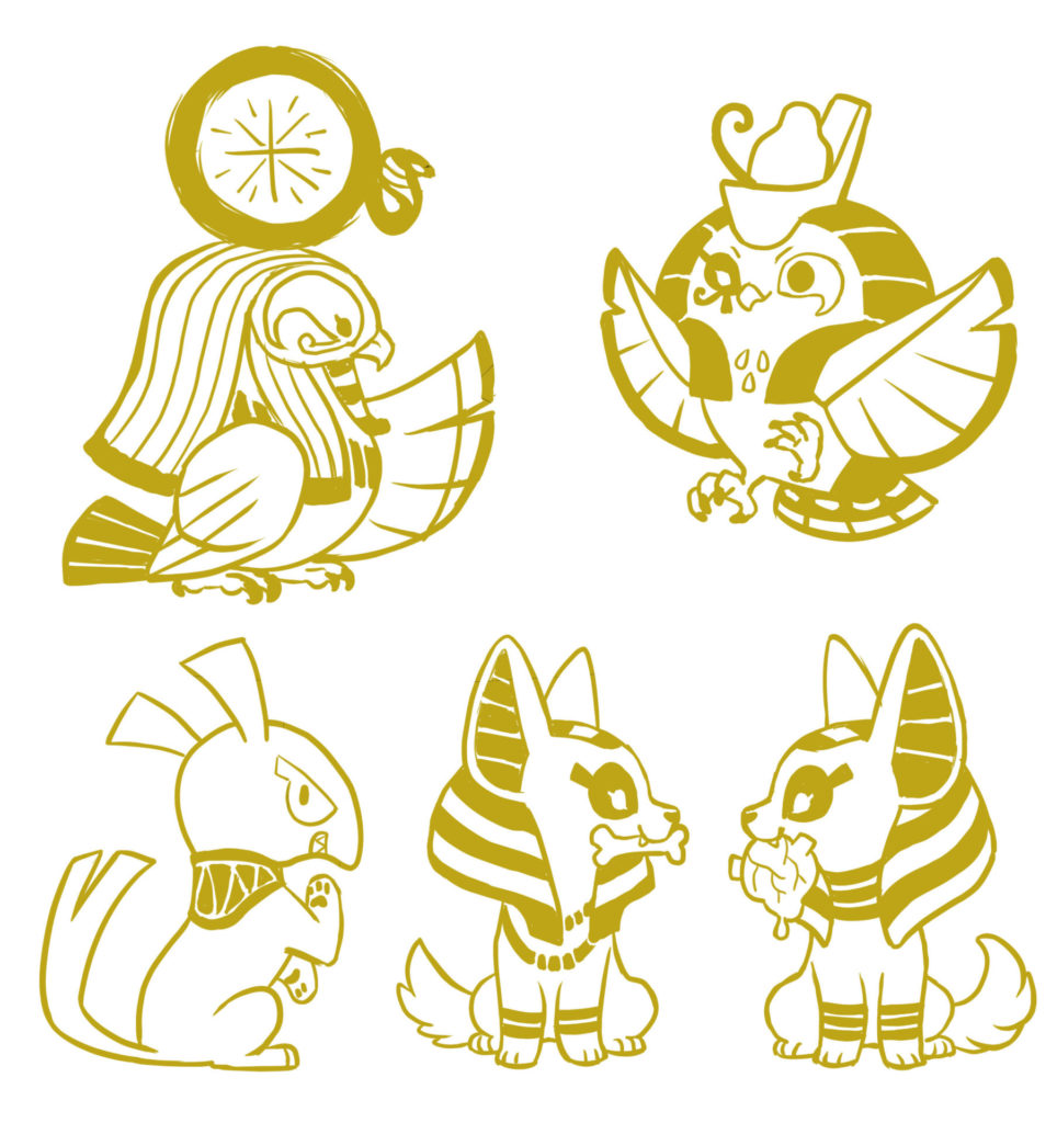
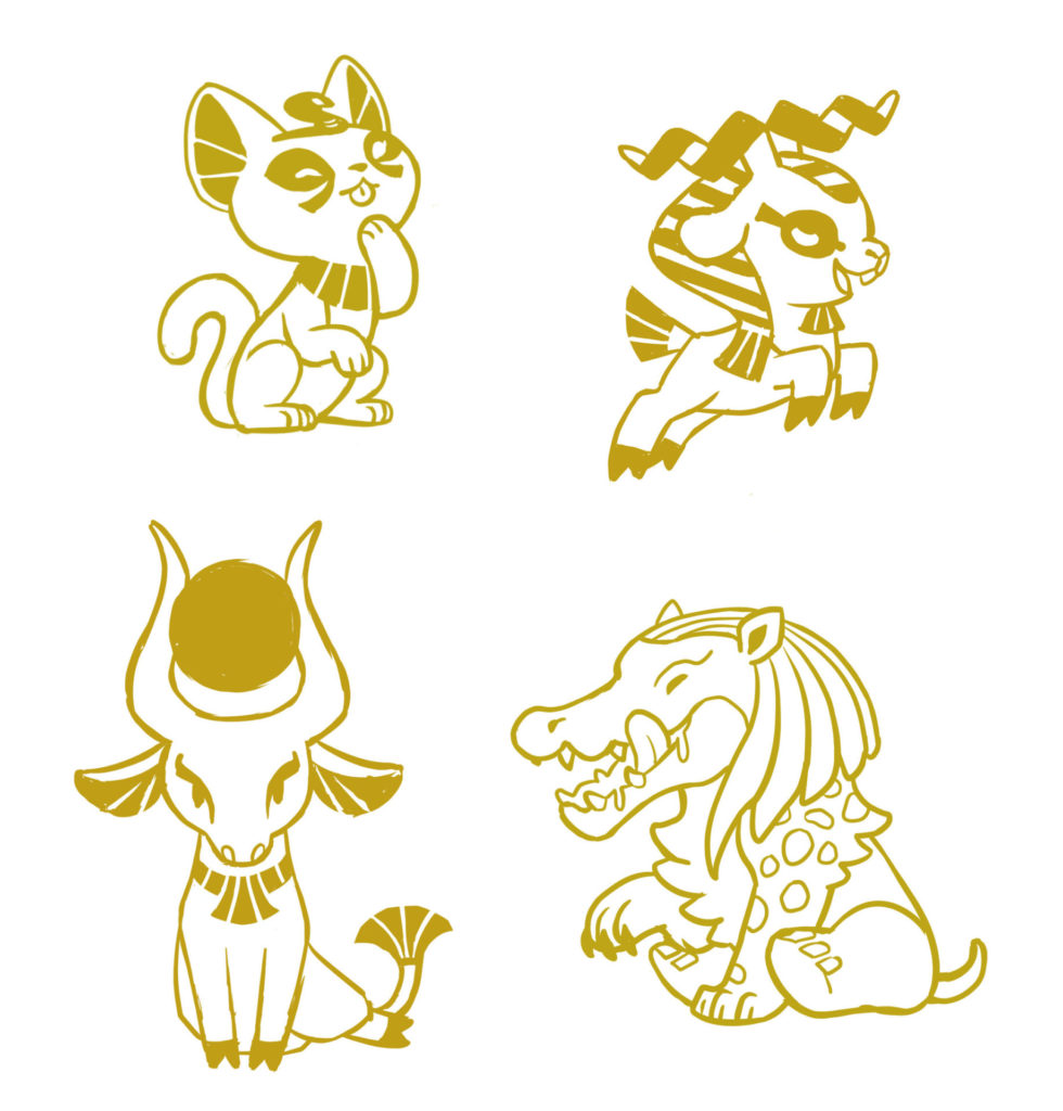
I always really recommend artists vector their own pin art. This takes longer but gives you full control over all the little choices that get made when preparing art for mold carving. It’s the last chance to notice things that could be improved! Ultimately pin design (all design…) really benefits from attention to detail. Most people won’t consciously notice these little things but I believe they still register subconsciously. A layman doesn’t need to know why they like something, only that they do.
By the end of the campaign, Tiny Pantheon had over 2000 backers who backed for some 10,000 pins. That’s not a typo. Ten thousand pins! Plus a large additional margin to cover for production errors and extra stock. It was an absolutely mad undertaking for one person running a small art business out of their home. I ended up prevailing on several friends to help me quality check, polish and card every single pin while I focused on getting everything packed. I packed every single order myself, for final quality control and because that was the best way to streamline our process with my single laptop.

I could go on for literally hours about the do’s and don’ts and side-eyes of pin design (and have in the past, usually at unfortunate friends) but that gets into opinionated rant territory so let’s move on to my thoughts on marketing and campaign management stuff instead:
First things first – keeping information super visual and organised does a lot for a campaign and after design appeal that’s the number one stumbling block for a lot of underperforming crowdfunding campaigns. Even while the Tiny Pantheon campaign was live I spent a lot of my time fine-tuning graphics to make things as clear as possible as feedback came in. Tiny Pantheon also had a consistent visual aesthetic that fit the product and emphasised the pin art. I’ve seen people copy my campaign aesthetic pretty directly when it did not fit their product (black backgrounds for a pastel coloured collection? uhh) and that’s a mistake. The campaign look helps possible backers understand not only what kind of thing they’re backing but also how professional you are. If the campaign looks like hot garbage, the obvious assumption is that the end product will too.

Pin campaign rewards are easy – you just offer different quantities of pins. But what you really want to do is offer fun rewards. People who are tempted by something might be pushed over the edge if you offer it in a fun way. For Tiny Pantheon I had two “fun” rewards: 1. a random pin shipped out in blind packaging for people who liked the project enough to support but were paralyzed by choice and 2. a limited expensive tier that got every single reward that was unlocked in the campaign – it was a gamble but if the campaign did very well it became a very good deal. This reward made backing for the whole set an easier decision for people tempted by everything and those big early pledges helped the entire campaign by getting $$ goals unlocked faster, which is reassuring for uncertain backers. Coming up with fun rewards can also be a way to engage with people and show a little bit of your own personality, which is important for an artist on the internet.
I also ran two small social media campaigns – completely new pins that unlocked once the promo posts on Twitter and Tumblr reached a certain number of shares. People genuinely want to support things they like but it helps to give them a clear way to do so and an obvious reward when they do. People want to feel involved, so come up with avenues for them to be involved!
On that note, letting backers vote for certain milestone designs was another tactic to get folks involved. I don’t know if this one really did much for the bottom line but folks enjoy it and, perhaps more importantly, it gave me something to post about. Coming up with good reasons to post about the campaign on social media helps to keep up the energy! It’s basically just manufacturing excuses to turn up on people’s social feeds and email inboxes and remind them that the thing still exists. Coming up with these fun excuses for posting before the campaign even begins can really help keep everything on track.

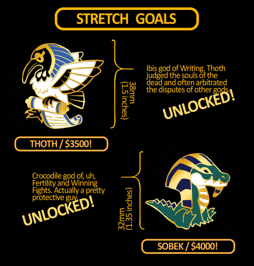
Finally, I did add freebie rewards to the campaign as milestones were unlocked – stickers because those are relatively cheap to make and even easier to slip into a parcel. I am of the opinion that these additional rewards don’t actually do much to materially help the campaign as it is happening (other than as an excuse to post more). Instead, they go a long way towards backer satisfaction. Little gratitude items like this do a lot to smooth over any delays or issues with delivery. And the fact is pretty much all crowdfund campaigns are doomed to have some sort of problem crop up! Tiny Pantheon had significant production delays because I went from expecting to make maybe a couple thousand pins to over ten thousand in the space of one month. These things happen!
There’s more I could talk about – buying ads on various sites (mostly not useful to me, but I’m not very knowledgeable about that sort of thing), the importance of communication (duh, but it’s still hard), the custom themed paintings I offered as part of the rewards (fun but probably unnecessary work for me), the Pledgemanager post-campaign that allowed people to choose designs and add more stuff to their pledge (worth it, significant boost to earnings), the production error rate of pins (always order an additional 20-30% on what you think you will need), even more ranting about vectoring and customer service. Boy, the list goes on! I think I’ll leave this post where it is or else I’ll be writing a disorganised manual instead of a casual retrospective.
I don’t know if I’ll ever get the chance to take on a project of the scale of Tiny Pantheon again. I hope so! It was something of a personal highlight but I’d like to take what I have learned since and make something even bigger and cooler. I somewhat regret that I didn’t do more with it immediately after. Strike while the iron is hot and all. But it spawned a lot of copycats – some more egregious than others – and that was discouraging. Not because they were infringing exactly but because I thought the market got so saturated that there wasn’t much point to adding more myself. Maybe that’s silly! I’ll never know.
Funnily enough, the designs started out years before as an idea for plush toys. My attempts to make that happen have not gone well, mostly due to manufacturers being dodgy. I still want to do it though so who knows what the future will bring! Maybe my next big project will end up being Tiny Pantheon characters again after all.